

Advertisement Evaluation
For my advertisement I wanted to keep the colors cool. I kept the text simple as well so it would be easy to understand, and the reader does not have to read a lot to get the information.
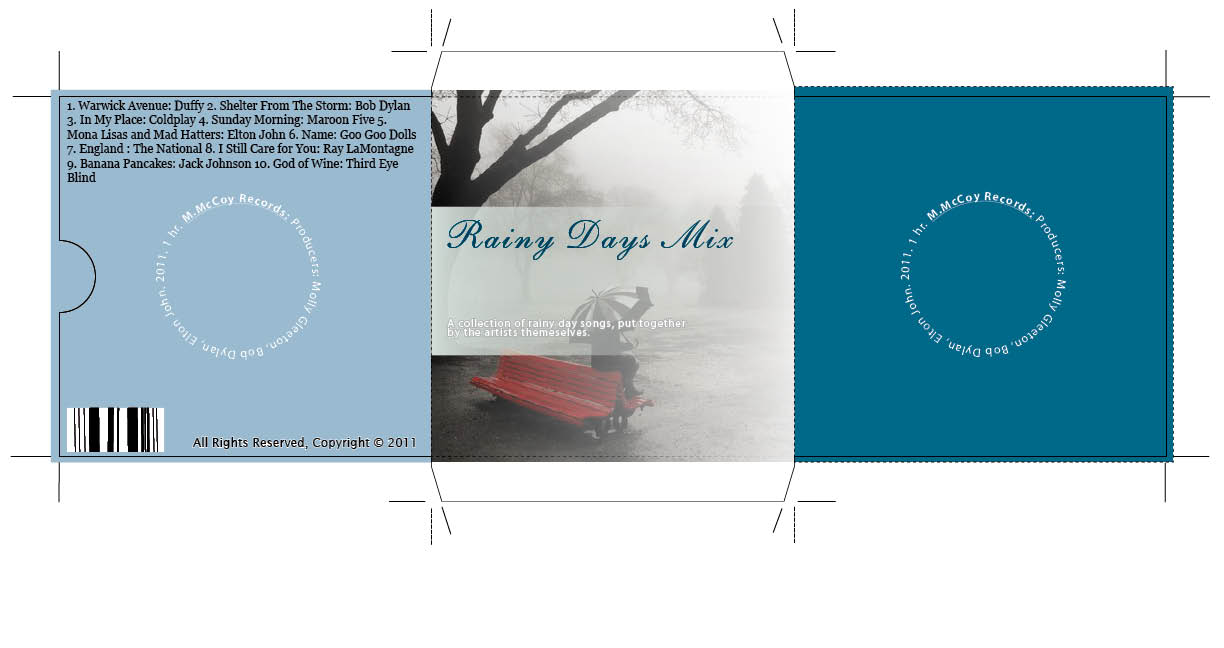
CD Cover Evaluation
I wanted to create a simple design when creating the CD cover, so I went with a theme and color scheme that used cool colors. I wanted my cover to be simple and not too distracting. I listed all of the songs on the back cover in a circular shape.
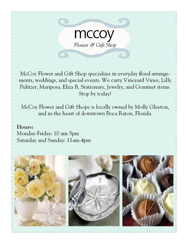
Flyer Evaluation
For my flyer I had the same idea as the CD Cover and Advertisement. I wanted to keep the content simple so the person looking at it knew right away what the stores business was.